New look and feel
17/12/2021
Webdashboard turned 3 years old in November. To mark this occasion we implemented a new look for Webdashboard. We think most of the user requests are met. We also revisited every popup and screen to make the solution as streamlined as possible.
The buttons
Back in 2017 we decided a button with a full width at the bottom of a popup looked great. Now we changed these buttons to controls that look like buttons.
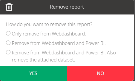
Confirm popups
All confirm popups are now the same. The yes/no buttons aren’t in the theming anymore and are always red and green.
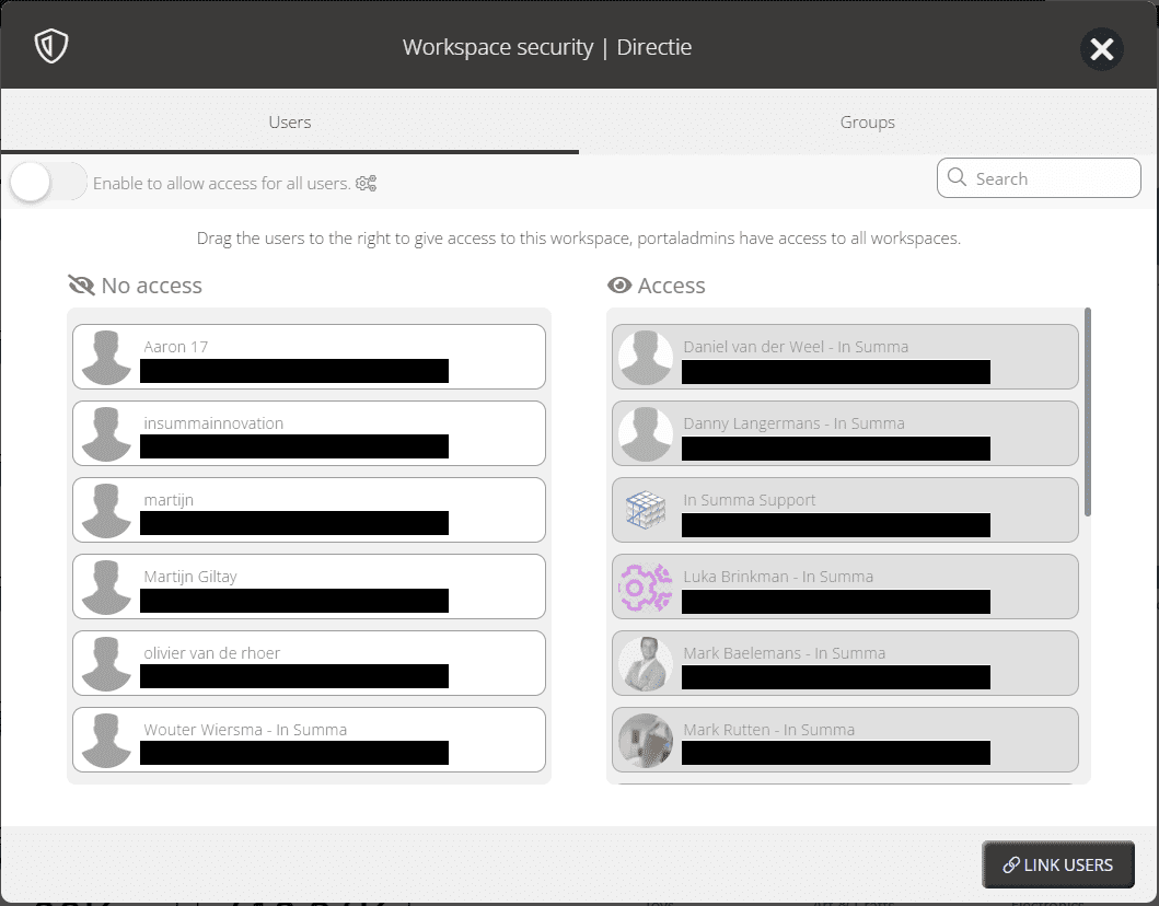
Scollbars and Security
Scrollbars are now always visible. When a scrollbar is needed, you’ll always see it. Next to that, the security screens to add users is made the same everywhere.
– Adding users/groups on Workspace level
– Adding workspaces in the user/group management
– Adding users to groups
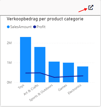
Widget navigation
The navigation form the widgets ‘Report Visuals’ and ‘Text & Link’ is now moved to the header of the widget.
Resize navigation bar
There is now an indicator that you can resize and the area where you can resize is made bigger.
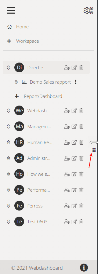
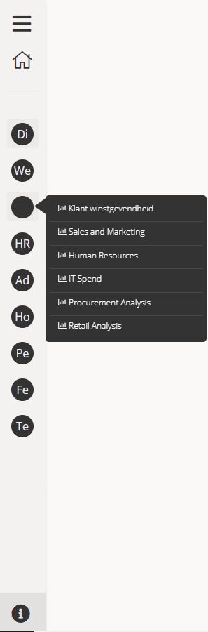
Small navigation bar
When the navigation bar is in simple mode, it’s now possible to navigate to reports below the workspaces.
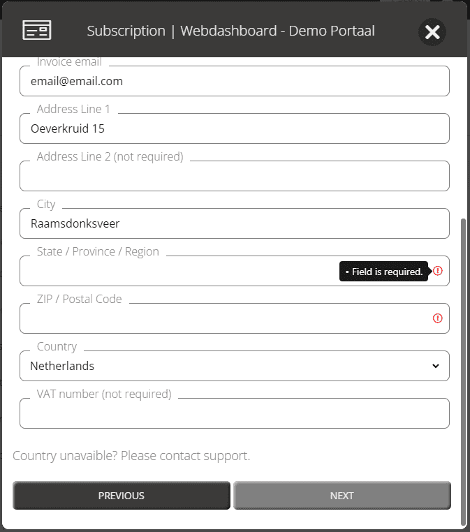
Text and dropdown controls
All the text and dropdown controls are reworked. Information about a control, errors and if input is required is now visible in the same way on everything.
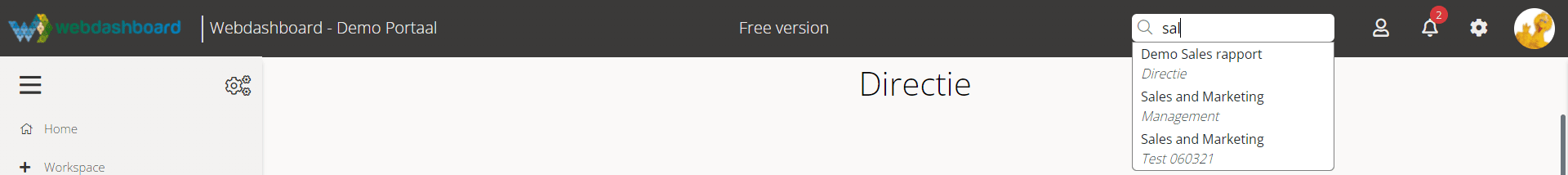
Search more accessible
Because we made the navigation bar in simple mode more useable. We moved search from the navigation bar to the header. So it’s always accessible.